Ev & Ex Agency

Brand Visual Identity
The Vision
Ev & Ex bridges the gap between events and experiential marketing. As a rising force in the industry, their identity needed to bypass traditional clichés and communicate absolute precision, partnership, and measurable impact. The goal was a monolithic, high-contrast visual language that feels architectural and tech-forward.
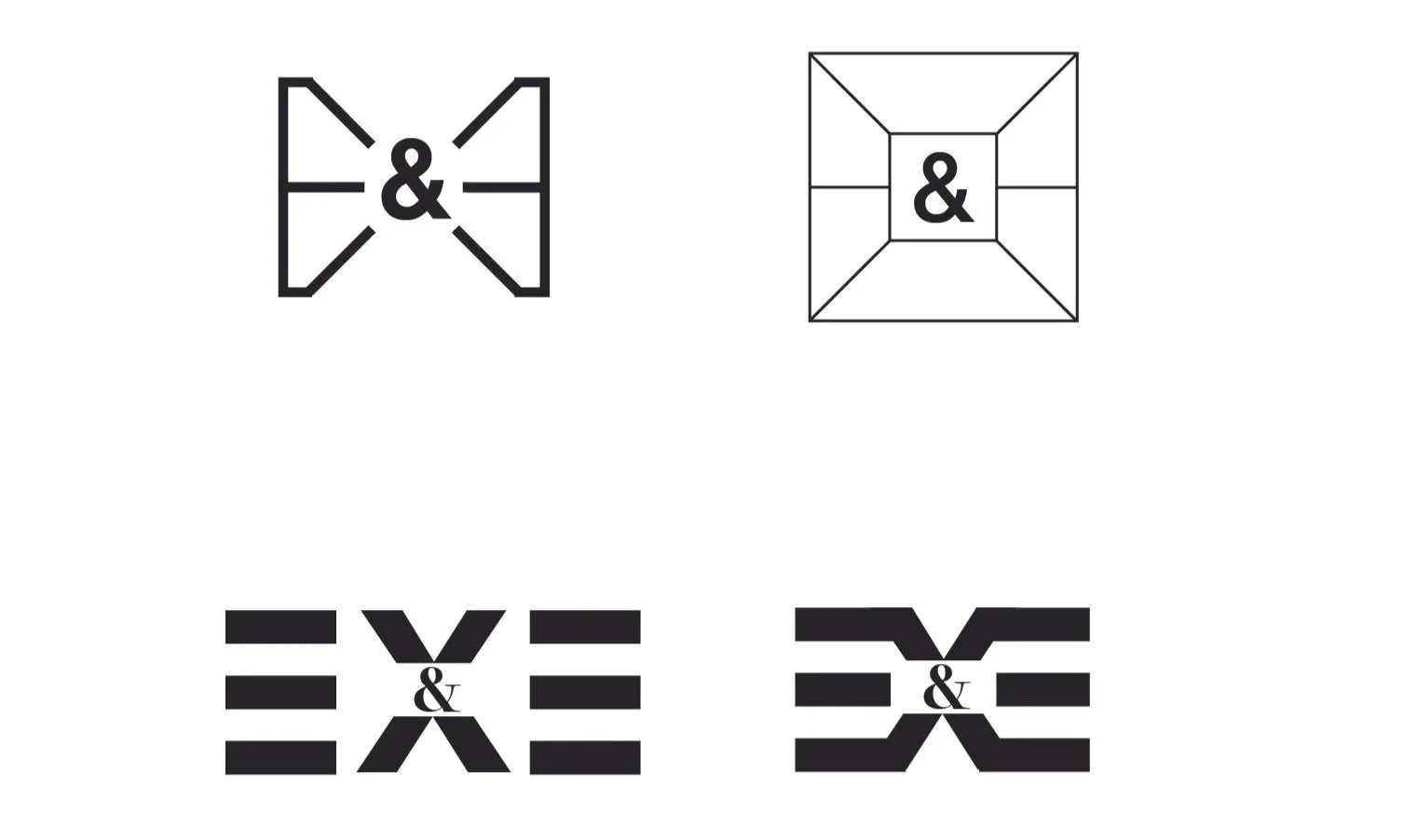
Deconstructing the Mark
The Center of Connection

The Ampersand
Serving as the foundational anchor, this symbol represents the ultimate collision of forces: Strategy & Creative, Virtual & Physical, Agency & Client.

The visual crosshair

Geometric lines surround the center and converge inward. This creates a high-tension focal point, emphasizing execution and the magnetic pull that draws audiences to a central moment.
The Box Frame
A stark outer boundary contains the mark, symbolizing the agency's ability to deliver boundless creativity while operating flawlessly within the defined realities of strategic execution.
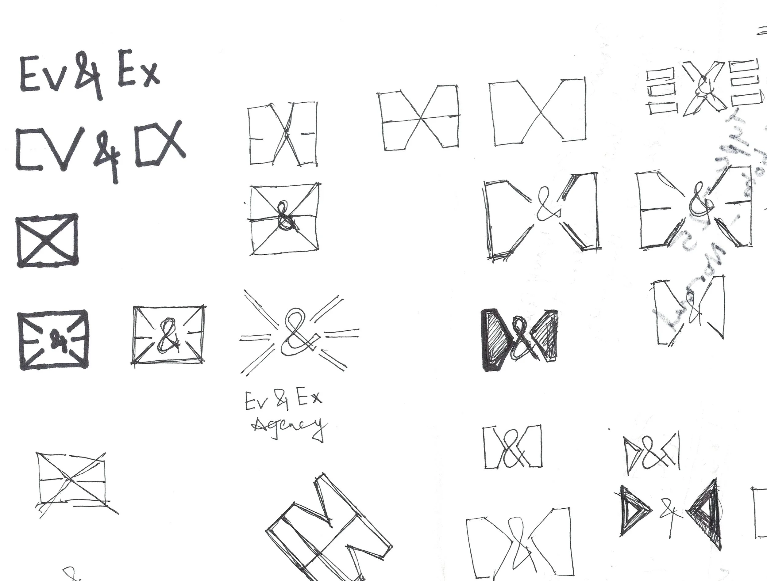
initial sketch & Other iterations played with horizontal motion and intersecting angles, stacking forms to create a sense of forward momentum, technical precision, and structural engineering.